Design Systems
Tokens, component libraries, Storybook documentation, governance frameworks, and rollout support. We treat design systems as a commercial capability — not just internal hygiene.
Scope
What's included
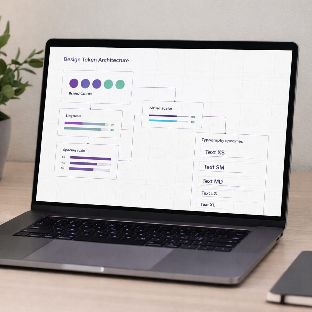
- Design token architecture (colour, spacing, typography)
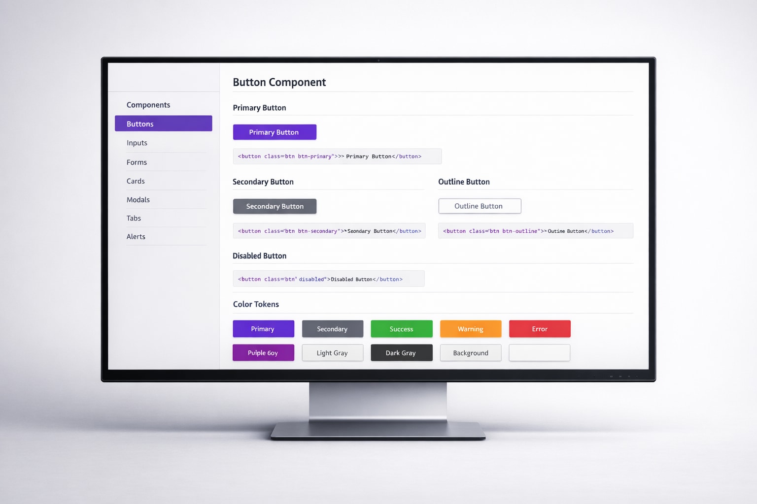
- Core component library (20–30 primitives)
- Figma component library with variants
- Storybook documentation site
- Governance framework and contribution guidelines
- Adoption roadmap and team onboarding
- Integration with existing codebase
- Ongoing maintenance guidelines
How we work
How we build systems
Audit & Discovery
We audit your existing design and code to identify inconsistencies, patterns, and reuse opportunities.
Token Architecture
Define the foundational layer: colour, spacing, typography, and motion tokens that drive every component.
Component Development
Build production-ready components in React with Storybook docs, accessibility, and responsive behaviour.
Governance & Rollout
Establish contribution guidelines, versioning strategy, and onboard your team to maintain the system.
Our craft
Proof in motion


What you receive
Deliverables
Everything is documented, handed over, and yours. No black boxes.
Best fit
Ideal for teams who
- Have UI inconsistency across products or teams
- Want to accelerate development with reusable components
- Need a system that bridges design and engineering
- Are scaling and need consistency without bottlenecks

Scale with consistency
Let's discuss how a design system can reduce your delivery variance and increase velocity.
No pitch deck, no pressure — just a focused conversation about your project.